Color as a language of fashion
Elegance is never accidental: it results from thoughtful choices involving cut, fabric and, above all, color. In a man’s outfit, the color palette communicates who we are and the image we want to project. According to psychological studies, color can influence how others perceive us and suggest professionalism, creativity or discretion. In high-end tailoring, every detail is designed to convey a precise message, and color becomes a form of nonverbal language. Choosing the right shade for the season or the occasion is equally important: the ideal outfit for an evening ceremony will differ from the one suited to a summer business lunch. This article explores color theory, the principles for creating harmonious combinations and practical guidelines for selecting the right tone based on complexion, context and season.
Color theory and fashion: from basics to complementaries
Color theory is the foundation of any successful combination. It is helpful to understand the main color categories and how they interact, just as Johannes Itten’s color wheel illustrates.
Primary, secondary and tertiary colors
Primary colors are the “building blocks” from which all other shades derive. In the traditional RYB (red–yellow–blue) system, they are magenta (red), cyan (blue) and yellow. They cannot be created by mixing other colors and form the basis for all combinations. An artist could work for months with just these three colors plus black and white.
Secondary colors arise from mixing two primaries: yellow and red produce orange; yellow and blue create green; red and blue generate violet. Mixing a secondary with an adjacent primary yields a tertiary color (such as yellow-orange or blue-violet). These categories structure the color wheel, a tool we will use shortly.
Complementary Colors
On the color wheel, opposite colors are called complementaries. When placed side by side, they create a vivid contrast; when mixed, they tend to neutralize each other into a greyish or whitish tone. For example, red’s complementary is green, and blue is opposite orange. Knowing complementary colors is essential for adding a touch of vibrancy to an outfit without disrupting overall harmony.
Light, Dark and Vibrant Base Colors
Beyond the primary/secondary/tertiary division, shades can be grouped functionally. A common reference guide classifies colors into three categories: light-based tones (beige, white, ivory, light grey), dark-based tones (black, dark grey, blue, brown) and vibrant colors (orange, red, green, etc.). This distinction is useful for identifying balanced combinations. Pairing two light shades like beige and white creates a bright effect, while combining a dark tone with a vibrant one—such as black and red—results in an elegant contrast.
Color-Matching Schemes in Fashion
Monochromatic, complementary, triadic and analogous
By using the color wheel, several matching schemes can be identified:
- Monochromatic: using different shades of the same color. A navy suit paired with a light blue shirt and a cobalt tie is a classic example. This approach adds depth through variations in intensity.
- Complementary: pairing colors opposite each other on the wheel (blue and orange, violet and yellow). In formal looks, it’s advisable to soften contrasts by choosing gentler, muted versions of these colors.
- Triadic: selecting three colors that are evenly spaced on the wheel. This scheme is more lively and should be used carefully to avoid excess.
- Analogous: combining neighboring colors such as blue, blue-green and green. The result is a refined, sophisticated harmony.

Neutral palette: the foundation of the wardrobe
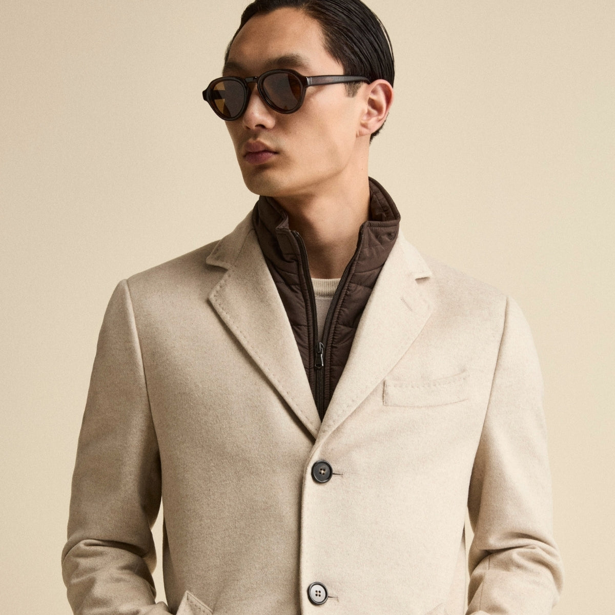
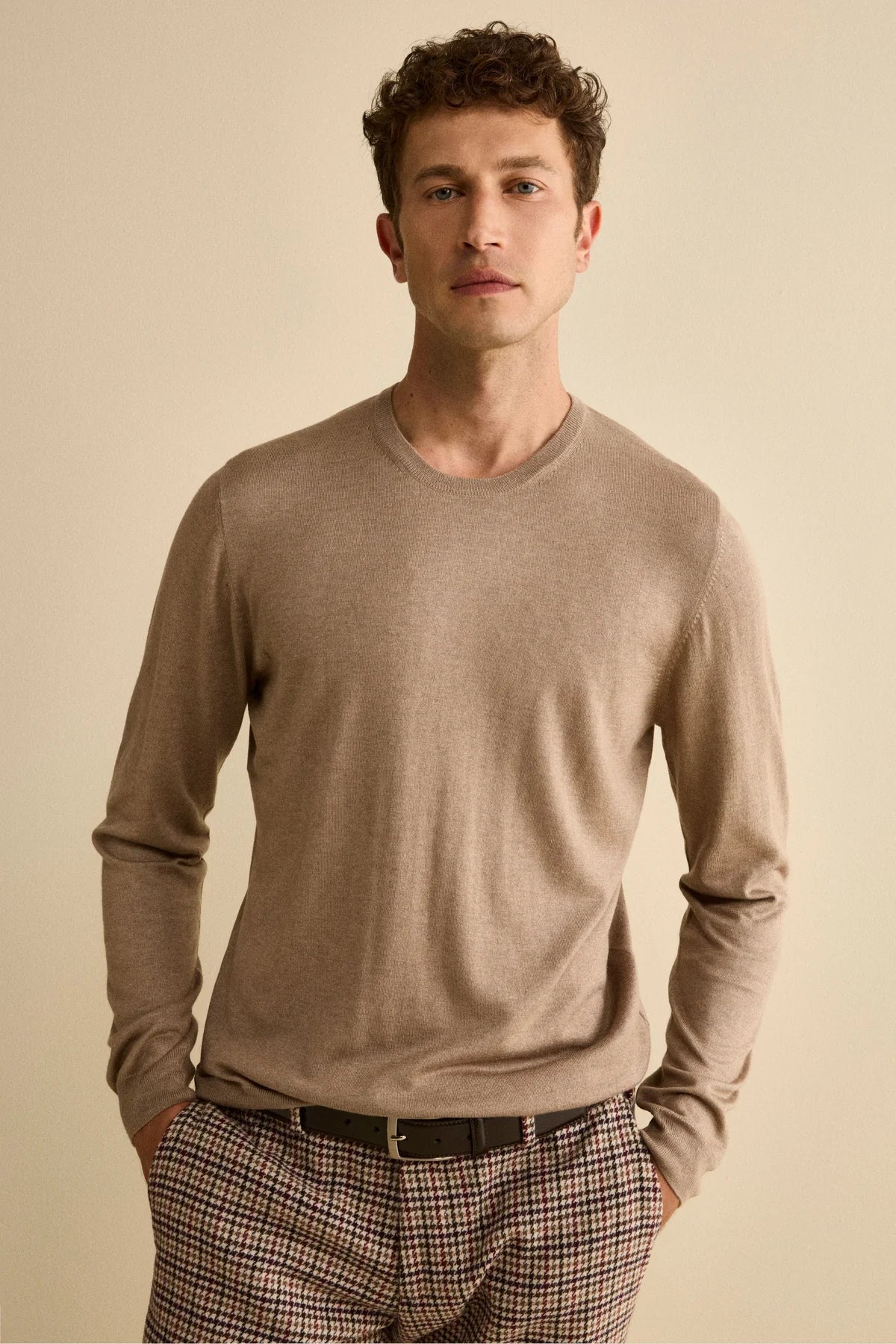
In a men’s wardrobe, neutral colors form the basis of any elegant combination. Shades such as blue, grey, beige, white and black are versatile and pair easily with one another. Dark-based tones (black, blue, brown) tend to appear more formal, while light-based tones (beige, white) add brightness. The timeless elegance of a blue suit, for example, comes from its ability to convey confidence and professionalism. A grey suit, on the other hand, suggests composure and diplomacy, while black is synonymous with absolute formality.

These neutral colors serve as a canvas on which to build the rest of the outfit: shirts, ties and colorful accessories find balance next to a navy or pearl-grey suit.
Creating harmonious combinations for perfectly balanced outfits
Once the basics of color theory are understood, it’s time to apply them to create harmonious looks. The rules listed here are guidelines: fashion—especially contemporary menswear—leaves plenty of room for creativity. However, knowing the fundamentals allows you to experiment with intention and confidence.

Tone-on-tone (monochromatic)
Tone-on-tone matching involves using different shades within the same color family. Pairing a light-blue suit with a blue-and-white striped shirt and a dark-blue tie is a classic example. This scheme adds depth without relying on strong contrasts. It’s particularly suitable for formal settings where a polished yet understated look is preferred.
Complementary colors and subtle contrasts
Complementary matching uses colors that sit opposite each other on the color wheel. Blue and orange, purple and yellow, green and red are combinations that naturally draw attention. In office looks, it’s best to soften the intensity: a navy suit can be brightened with a burnt-orange pocket square, or a charcoal outfit can be enhanced with a mustard-yellow tie. The key is moderation: avoid pairing more than three colors at once and avoid combining two pure primaries or two pure secondaries.
Analogous and triadic combinations
Analogous combinations are based on neighboring colors. Pairing blue, blue-green and green—for example, a navy blazer with a turquoise shirt and a moss-green pocket square—ensures chromatic coherence. Triads, made up of three evenly spaced colors on the wheel, are bolder. A classic example is blue, red and yellow; in menswear, desaturated versions (navy, burgundy and mustard) are often preferred.
Color accents and accessories
Accessories are the easiest way to introduce touches of color. A burgundy tie, an olive-green pocket square or a pair of striped socks can enliven an outfit without disrupting its balance. Old Money aesthetics recommend maintaining a hierarchy between the dominant element (the suit), the supporting element (the shirt) and the accent (tie, pocket square). This principle prevents a “patchwork” effect and highlights the main garment.
Choosing colors based on complexion and hair
Personal color analysis isn’t just about aesthetics—it greatly affects overall harmony. A combination that complements the complexion brings light to the face; unsuitable tones, on the other hand, can dull one’s appearance.
- Dark complexion: light colors work best; tones like beige, cream, light blue and pastels create refined contrast.
- Fair complexion: vibrant or more intense colors are recommended. Blue, emerald green, burgundy and warm brown enhance fair skin.
- Light hair: pastel tones (sky blue, pale pink) highlight blond or grey hair.
- Dark hair: warm colors such as brown, rust and olive green create a harmonious balance.
These rules aren’t rigid—experimentation is always welcome—but knowing these principles helps avoid common mistakes.

Seasonal palette: colors for every time of the year
Elegance also expresses itself through a thoughtful use of color according to the seasons. Shades shift with light and temperature, offering endless combinations.
Spring and summer
Warmer seasons favor light, fresh colors. Light-blue, pearl-grey or beige suits are ideal for daytime weddings or summer events. Accessories in linen or raw silk complete the look.
Autumn and winter
For colder periods, deeper and darker tones are preferred. Brown, bottle green and anthracite grey provide visual warmth and suit the mood of shorter days. A dark-grey flannel suit paired with an ivory shirt and a burgundy tie is a perfect example for winter. On autumn days, a brown herringbone blazer combined with beige trousers and moss-green accessories embodies seasonal elegance.

Common mistakes to avoid when combining colors in clothing
Even the most beautiful fabric can lose its appeal if paired incorrectly. Here are the main pitfalls to avoid:
- Too many colors: using more than three distinct colors in one outfit risks creating visual confusion. A reliable method is to choose two dominant colors and add a third only as an accent.
- Wrong combinations: avoid pairing two pure primary or two pure secondary colors (for example, bright red and intense blue); it’s better to go for softer or desaturated versions.
- Too much uniformity: wearing the same color in identical shades (for example, three identical blues) can look monotonous. Tone-on-tone works only when the shades differ in intensity and brightness.
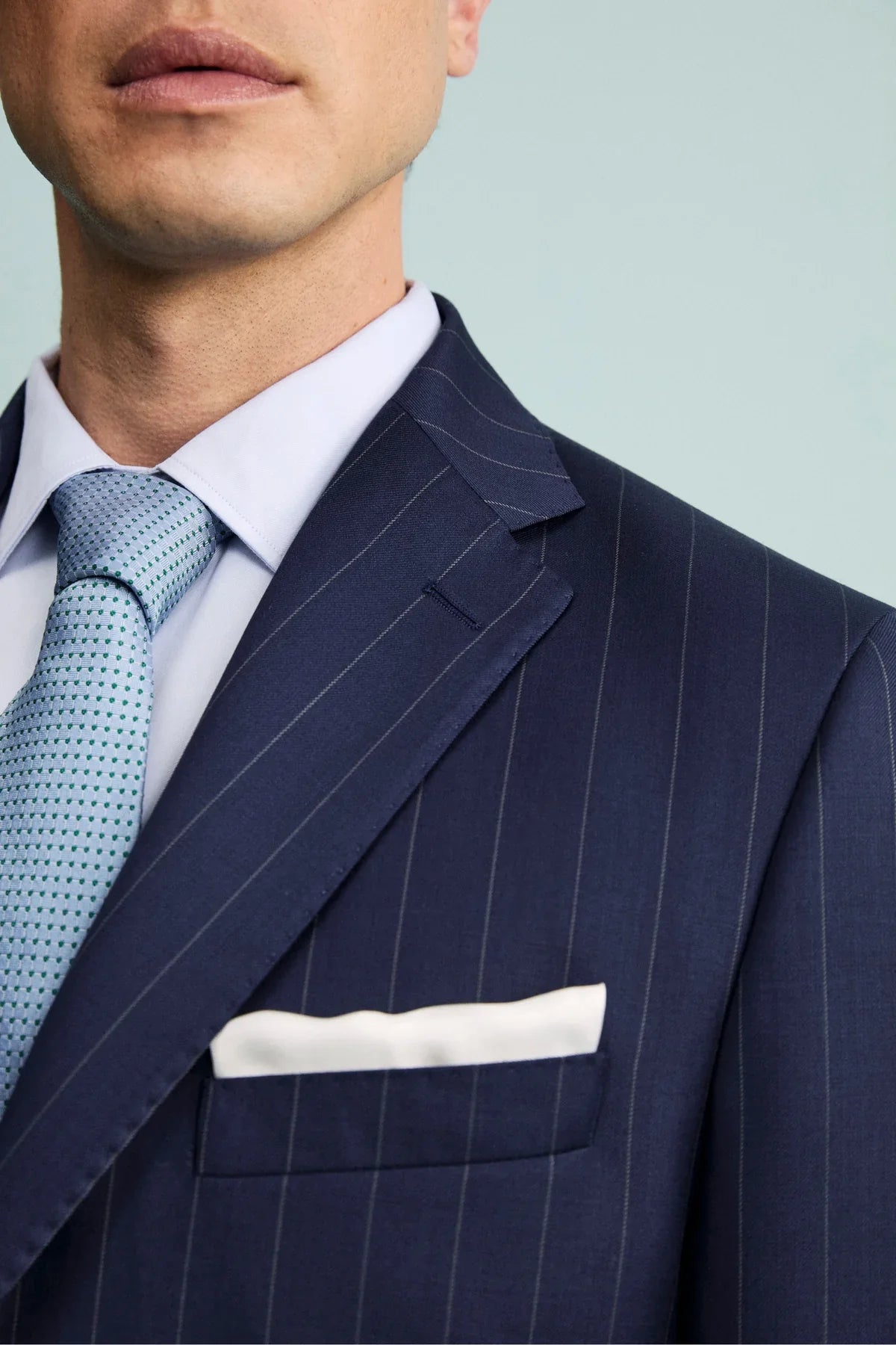
- Clashing patterns: stripes with stripes or checks with checks can create visual overload. If you choose a pinstripe suit, the shirt and tie should feature patterns that differ in scale or stripe spacing.
- Ignoring formality: some fabrics require specific accessories. A pinstripe suit, for instance, should always be worn with a tie and formal shoes. Showing up in sneakers or without a tie disrupts the balance of the look.
- Forgetting the complexion: pairing colors that don’t complement the skin tone can weigh down the appearance. Always remember to consider complexion and hair color, as mentioned earlier.
